Posts

LIS 4317 Final Project: R Chart showing Game Price changes over time
Image
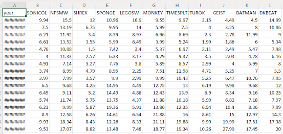
 For this final project, I remembered the concept of used game prices tending to increase over time, especially older ones (more than 15 years old or so). With the lack on any decent visually-based references to measure the change in time these prices have had, I took it upon myself to make my own. Since no database I could find contained price listings, I obtained my own using PriceCharting.com. I selected a few random games released for the Nintendo GameCube, and recorded the price listing for "loose" games (only the disc). I then compiled all of the prices into an Excel CSV and imported it into RStudio. For clarification, the games I chose were (from left to right): Sonic Classics Collection Need For Speed: Most Wanted Shrek: Extra Large SpongeBob Squarepants: Battle For Bikini Bottom Lego Star Wars: The Video Game Super Monkey Ball TimeSplitters 2 Turok: Evolution Geist Batman: Dark Tomorrow Donkey Kong Jungle Beat I then made a ggplot function that would allow me to easi...

Final Project: DescribeR v1.0.0

 After some time, I'm thrilled to finally release the source code for my first ever R package. Alongside the first three functions I described in the original description file, I've also added an additional interactive_heatmap function that can create heatmaps of correlating numerical data in a given dataset. It's my hope that this package will make exploratory analysis easier for those dealing with unfamiliar sets of data, leaving more time to figure out more advanced uses for said data. GitHub repository for DescribeR: https://github.com/Retrolovania/DescribeR

Module 13: Animating in R

Image
 Using Yihui Xie's animation package, I opted to try to make a simple animation of a bouncing ball. While I'm more than pleased with the results, I'm still at a loss as to why the ball isn't bouncing as it should (it's meant to flatten somewhat at the bottom). Regardless, it's still fascinating to see an actual animation having been created with only R code. Code: library (animation) # Function to create the animation frames bounce_animation <- function (height = 10 , gravity = 0.1 , nframes = 25 , x = 0.5 , filename = "bounce_animation.gif" ) {   # Initialize variables   y <- height   velocity <- 0   squished <- FALSE      # Create and save the animation   saveGIF({     for (i in 1 :nframes) {       # Update position and velocity       y <- y + velocity       velocity <- velocity - gravity              # Squish effect when ball ...

Module 11: Plotting Dr. Piwek's graph.

Image
 I opted to attempt to display Piwek's ggplot2 implementation. After some fuss over getting the libraries loaded, I was met with very promising results after running the code provided:

Module 12 Assignment: Visual Social Network

Image
 For this assignment, I once more opted to use RStudio, as it's what I more used to when it comes to creating visual representations of data. To get started, I opted to try out the example code left on the assignment page to get a sense of how RStudio handles projects like this. Once it was made more clear how to make such visual plots, I aimed to experiment with a template dataset and see what I could make. While it was certainly a fun visual exercise, there's still a lot I want to try to research regarding how analysis plots like this can be made, including how to add more details that can be shown through varying visual devices, like colors and different shapes for each node, as well as better labeling for the legend.

Module 11: Debugging in R

Image
 Upon loading in the given code example for this assignment, the first thing I attempted to do was to simply run the code and see what would happen in order to better isolate a potential issue. That gave me the error shown here: Clearly something was amiss with the return argument, so that was the line I checked. It became obvious looking at it further that said argument shouldn't have been part of the same line as the line in brackets, so I isolated it into its own line. Making this fix allowed the code to be properly executed, and for the function to be created. Next was testing the function with an example matrix. Initially, it failed with this error: This exposed the other issue with the functions code; it seemed to depend on another function dubbed tukey.outlier that was completely missing, and therefore was interfering with the function's ability to be properly used. Commenting the line out and redefining the function allowed it to properly work once more. Resulting code ...

Module 10 Assignment: Time Series with ggplot2

Image
 Experimenting with data over a span of time is something I've done with ggplot2 for quite some time; one such example was during the previous year when I wrote a series of functions to create visualizations of the price of certain videogames over the course of a decade. For this assignment, I opted to go for something more simple: a line graph showing the rate of employment from the late 1960's up to the mid-2010's using data from the economics dataset. ggplot ( economics , aes ( x = date , y = unemploy ) ) + geom_line ( ) + geom_smooth ( ) + labs ( title = "Time Series Plot of Unemployment with Smooth Trend Line" , x = "Date" , y = "Unemployment" ) + theme_minimal ( ) The addition of a trend line makes the data presented here more easily understandable to onlookers, with the main message of the data being made clear in the presentation, that being that unemployment in recent times has been steadily incre...

Final Project Proposal: DescribeR

 For the R package to make at the end of this course, I've decided to make a package called DescribeR. This package (hopefully) will be able to instantaneously provide a detailed summary of any data type given to it, from a typical variable held within RStudio's memory to descriptions of the columns in a given data frame. I'd also like to have the package utilize ggplot2 to make example visualizations of data frame information so as to better have the user understand the variables in said data frame and how they relate to one another. No two graph outputs should be alike when coming from the same data frame. GitHub link to description file: https://github.com/Retrolovania/R_Programming/blob/main/DescribeR/DESCRIPTION.txt

Module 9 Assignment: Three Types of Graphs

Image
 For this assignment, I used the Guns dataset from Vincent Arel Bundock's list. Said dataset contains various information related to gun-related crimes committed in the United States during the later 20th century. In terms of graphing, I experimented with making a different type of graph for each library we've gone over, including base R, lattice, and ggplot2. While all three implementations of visual plotting have their own individual strengths and weaknesses, I feel ggplot2 is the better out of the rest, since it takes the good parts of the other two (base R's simplicity and lattice's ability to work better with large amounts of data) and introduces more versatile elements to work with. GitHub code: https://github.com/Retrolovania/R_Programming/blob/main/Module%209.R

Module 9: Multivariate Graph in R

Image
 Using the mtcars dataset, I sought to make a graph that mainly compares the miles per gallon a car can have by the weight of said car, with other variables in the dataset being used to add more detail to each point on the graph. Looking at the results, it's clear to see that a heavier car has correlation with cars that get lower gas mileage, even with more cylinders in the engine or higher rates of horsepower. The graph is able to communicate this point clearly and effectively by following the five core principles of design, including maintaining simplicity, putting emphasis on cars with higher levels of certain variables by affecting the point's size and color, maintaining visual balance, having the data be consistent, and having the data organized in hierarchical data, with the heaviest weights followed by the lightest.

Module 8: Messing with CSV and Manipulating Data

Image
 While getting the mean in general is something I'm well acquainted when using R, the method needed in this circumstance was quite new. Having never used the plyr library before, it took a bit of time to figure it out and get the desired result: Making the data subset was also new, as well as interesting. While I knew adding columns to an existing data frame was a common thing one could do, the way it was recommended to be done here was both unique and enlightening. GitHub code: https://github.com/Retrolovania/R_Programming/blob/main/Messing%20with%20CSV.R

Module 8: Visualizing Correlation & Regression with ggplot2

Image
 Few stresses the importance of correlation not implying causation, or that X is not generally the cause of Y. However, I think the argument can be made that it's at least involved to some degree, as we'll see in the results of my ggplot code below: As we can see by the graph's spotty plotting and the downward trend of the regression line, x (mpg) and y (carb) do not have much correlation, implying the two are practically distant factors. Now, let's view another example: cyl and hp have a greater correlation, resulting in tighter dots on the scatter plot and an upwards trend of the regression line. Even though it's cleat that the amount of cylinders doesn't improve horsepower in all instances (some dots with 6 cylinders have less hp than 4-cylinder ones), the connection is still made discernible. GitHub link for code: https://github.com/Retrolovania/R_Programming/blob/main/Module%208.R

Module 7: Adding Visual Analytics to an R Graph

Image
 While the first graph made in R was made rather simply, this one required a bit more work in order to try to make the most out of the potential R has for visualizing information. The code was written in mind to be able to accept a user's input, specifying the variables they want to compare in a visual representation. For example purposes, I overwrote the input to generate a bar plot comparing the miles per gallon a car is rated for compared to the number of cylinders in its engine. As we can see by the visual aid, the more cylinders a car has causes it to burn more fuel rather than cars with lesser amounts of cylinders. Few's recommendation on having data spread out so it's easier for the user to identify unique patterns in the visual aid plays off well in this example, though it could probably be improved by way of coloring each bar according to manufacturer, thereby adding an additional element to consider as well as better grouping the data together.

Module 7 Assignment: S3 V.S. S4

Image
  As shown here, an S3 value is both simple to set up and can be used by the generic function "list()" (said function can be used to interpret data of various types, thus the generic label).  It does, however, require that a class be added afterwards should the programmer require it. As we see here, S4 requires a bit more work in order to make a similar list. Unlike what we did for S3, S4 demands that the class for the list be set up before doing anything else, essentially ensuring it's part of the created list. The variables in the list being assigned individual slots is another difference it has with the S3 version, essentially allowing multiple inputs to be filtered into the same variable slot. Aside from the extra verboseness of S4, it's similar to S3 in almost every other way. GitHub for code: https://github.com/Retrolovania/R_Programming/blob/main/Module%207.R

Module 6: Our First Graph

Image
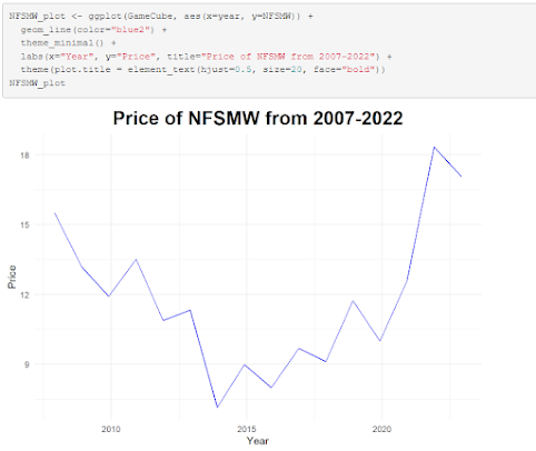
 Rather than use base R syntax for making a chart, I opted instead to use ggplot2, as it provides more options and is something I'm much more comfortable with and understand better. This graph showcases the price trend of a certain video game over time since its release in 2007. Over time, the price per copy has fallen, and then steadily rose during the pandemic years. While Stephen Few argues for the notion that correlation does not equal causation, I believe the pandemic could certainly be theorized as a contributing factor for the sharp increase in price per copy.

Module 6 Assignment: More with Matricies

Image
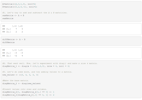
  Figuring out how to add values to an already-existing matrix took a fair amount of research + skimming through the textbook to figure out, but aside from that, this was a much more informative and fun matrix-involved assignment than the previous. GitHub link for code: https://github.com/Retrolovania/R_Programming/blob/main/Module%206.R

Module 5 Assignment: Figuring out Matricies

Image
 The original A and B matrices ended up not being in a proper format in order to find their inverse, so a fair bit of working around had to be done in order to find the solution. The process can be seen below: GitHub link for code: https://github.com/Retrolovania/R_Programming/blob/main/Module%205.R

Module 5: Discovering Plot.ly and understanding Plot of Whole

Image
 The main caveat with trying to visualize plot of whole is that it only really displays itself best when the data making up the whole can be fully separated into distinct parts. As we can see in this line + bar graph using the Average Position and Time dataset, however...  Both the position and time variables are connected together to the point that separating them into unique parts, like what a pie chart would do, isn't entirely viable. If, say, the data was instead about worker's weekly pay against the amount of money that can be shared between all of said workers, then Plot of Whole could be better realized in a visual depiction.

Module 4: Time Series Plot in Tableau

Image
 Using the data provided in the Monthly Modal Time Series dataset, I produced this multi-line graph showing multiple variable relating to vehicles in Springfield, IL, from how many licensed NTD IDs were created to the number of vehicular accidents over the span of five years. As the general population of this particular city has been decreasing in recent times, all of the numbers showcased in this graph are steadily decreasing with a sharp downward push in 2017-2018.

Module 4 Assignment: Boxplots and Histograms!

Image
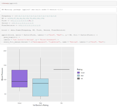
 In order to have a neater presentation of the boxplots for this assignment, I opted to use ggplot2 in lieu of the base R "boxplot" function. Reviewing the ratings given by both doctors, it seems that the 2nd was a lot more harsh, as the majority of his ratings were negative compared to the 1st. The majority of the blood pressure measurements taken are skewed to the left of the histogram, giving us an average blood pressure in said low area. (Mean = 102.6) GitHub code:  https://github.com/Retrolovania/R_Programming/blob/main/Module%204.R