Module 6: Our First Graph
Rather than use base R syntax for making a chart, I opted instead to use ggplot2, as it provides more options and is something I'm much more comfortable with and understand better.
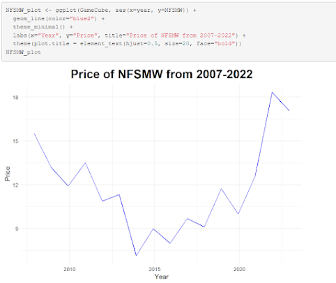
This graph showcases the price trend of a certain video game over time since its release in 2007. Over time, the price per copy has fallen, and then steadily rose during the pandemic years. While Stephen Few argues for the notion that correlation does not equal causation, I believe the pandemic could certainly be theorized as a contributing factor for the sharp increase in price per copy.


Comments
Post a Comment