Module 10 Assignment: Time Series with ggplot2
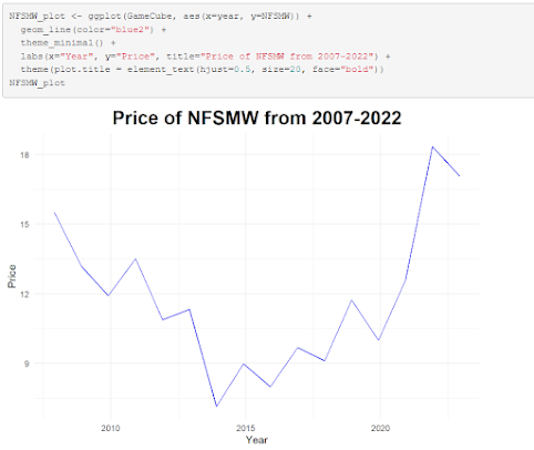
Experimenting with data over a span of time is something I've done with ggplot2 for quite some time; one such example was during the previous year when I wrote a series of functions to create visualizations of the price of certain videogames over the course of a decade. For this assignment, I opted to go for something more simple: a line graph showing the rate of employment from the late 1960's up to the mid-2010's using data from the economics dataset.
ggplot(economics, aes(x = date, y = unemploy)) + geom_line() + geom_smooth() + labs(title = "Time Series Plot of Unemployment with Smooth Trend Line", x = "Date", y = "Unemployment") + theme_minimal()

The addition of a trend line makes the data presented here more easily understandable to onlookers, with the main message of the data being made clear in the presentation, that being that unemployment in recent times has been steadily increasing despite a soft drop from the late 80's to the late 90's.


Comments
Post a Comment