Posts

LIS 4317 Final Project: R Chart showing Game Price changes over time

Image
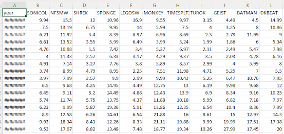
 For this final project, I remembered the concept of used game prices tending to increase over time, especially older ones (more than 15 years old or so). With the lack on any decent visually-based references to measure the change in time these prices have had, I took it upon myself to make my own. Since no database I could find contained price listings, I obtained my own using PriceCharting.com. I selected a few random games released for the Nintendo GameCube, and recorded the price listing for "loose" games (only the disc). I then compiled all of the prices into an Excel CSV and imported it into RStudio. For clarification, the games I chose were (from left to right): Sonic Classics Collection Need For Speed: Most Wanted Shrek: Extra Large SpongeBob Squarepants: Battle For Bikini Bottom Lego Star Wars: The Video Game Super Monkey Ball TimeSplitters 2 Turok: Evolution Geist Batman: Dark Tomorrow Donkey Kong Jungle Beat I then made a ggplot function that would allow me to easi

Final Project: DescribeR v1.0.0

 After some time, I'm thrilled to finally release the source code for my first ever R package. Alongside the first three functions I described in the original description file, I've also added an additional interactive_heatmap function that can create heatmaps of correlating numerical data in a given dataset. It's my hope that this package will make exploratory analysis easier for those dealing with unfamiliar sets of data, leaving more time to figure out more advanced uses for said data. GitHub repository for DescribeR: https://github.com/Retrolovania/DescribeR

Module 13: Animating in R

Image
 Using Yihui Xie's animation package, I opted to try to make a simple animation of a bouncing ball. While I'm more than pleased with the results, I'm still at a loss as to why the ball isn't bouncing as it should (it's meant to flatten somewhat at the bottom). Regardless, it's still fascinating to see an actual animation having been created with only R code. Code: library (animation) # Function to create the animation frames bounce_animation <- function (height = 10 , gravity = 0.1 , nframes = 25 , x = 0.5 , filename = "bounce_animation.gif" ) {   # Initialize variables   y <- height   velocity <- 0   squished <- FALSE      # Create and save the animation   saveGIF({     for (i in 1 :nframes) {       # Update position and velocity       y <- y + velocity       velocity <- velocity - gravity              # Squish effect when ball hits the ground       if (y < 0 ) {         y <- 0         velocity <- -velocity * 0.9   # Loss

Module 11: Plotting Dr. Piwek's graph.

Image
 I opted to attempt to display Piwek's ggplot2 implementation. After some fuss over getting the libraries loaded, I was met with very promising results after running the code provided:

Module 12 Assignment: Visual Social Network

Image
 For this assignment, I once more opted to use RStudio, as it's what I more used to when it comes to creating visual representations of data. To get started, I opted to try out the example code left on the assignment page to get a sense of how RStudio handles projects like this. Once it was made more clear how to make such visual plots, I aimed to experiment with a template dataset and see what I could make. While it was certainly a fun visual exercise, there's still a lot I want to try to research regarding how analysis plots like this can be made, including how to add more details that can be shown through varying visual devices, like colors and different shapes for each node, as well as better labeling for the legend.

Module 11: Debugging in R

Image
 Upon loading in the given code example for this assignment, the first thing I attempted to do was to simply run the code and see what would happen in order to better isolate a potential issue. That gave me the error shown here: Clearly something was amiss with the return argument, so that was the line I checked. It became obvious looking at it further that said argument shouldn't have been part of the same line as the line in brackets, so I isolated it into its own line. Making this fix allowed the code to be properly executed, and for the function to be created. Next was testing the function with an example matrix. Initially, it failed with this error: This exposed the other issue with the functions code; it seemed to depend on another function dubbed tukey.outlier that was completely missing, and therefore was interfering with the function's ability to be properly used. Commenting the line out and redefining the function allowed it to properly work once more. Resulting code

Module 10 Assignment: Time Series with ggplot2

Image
 Experimenting with data over a span of time is something I've done with ggplot2 for quite some time; one such example was during the previous year when I wrote a series of functions to create visualizations of the price of certain videogames over the course of a decade. For this assignment, I opted to go for something more simple: a line graph showing the rate of employment from the late 1960's up to the mid-2010's using data from the economics dataset. ggplot ( economics , aes ( x = date , y = unemploy ) ) + geom_line ( ) + geom_smooth ( ) + labs ( title = "Time Series Plot of Unemployment with Smooth Trend Line" , x = "Date" , y = "Unemployment" ) + theme_minimal ( ) The addition of a trend line makes the data presented here more easily understandable to onlookers, with the main message of the data being made clear in the presentation, that being that unemployment in recent times has been steadily incre