Posts

Showing posts from February, 2024

Module 8: Messing with CSV and Manipulating Data

Image
 While getting the mean in general is something I'm well acquainted when using R, the method needed in this circumstance was quite new. Having never used the plyr library before, it took a bit of time to figure it out and get the desired result: Making the data subset was also new, as well as interesting. While I knew adding columns to an existing data frame was a common thing one could do, the way it was recommended to be done here was both unique and enlightening. GitHub code: https://github.com/Retrolovania/R_Programming/blob/main/Messing%20with%20CSV.R

Module 8: Visualizing Correlation & Regression with ggplot2

Image
 Few stresses the importance of correlation not implying causation, or that X is not generally the cause of Y. However, I think the argument can be made that it's at least involved to some degree, as we'll see in the results of my ggplot code below: As we can see by the graph's spotty plotting and the downward trend of the regression line, x (mpg) and y (carb) do not have much correlation, implying the two are practically distant factors. Now, let's view another example: cyl and hp have a greater correlation, resulting in tighter dots on the scatter plot and an upwards trend of the regression line. Even though it's cleat that the amount of cylinders doesn't improve horsepower in all instances (some dots with 6 cylinders have less hp than 4-cylinder ones), the connection is still made discernible. GitHub link for code: https://github.com/Retrolovania/R_Programming/blob/main/Module%208.R

Module 7: Adding Visual Analytics to an R Graph

Image
 While the first graph made in R was made rather simply, this one required a bit more work in order to try to make the most out of the potential R has for visualizing information. The code was written in mind to be able to accept a user's input, specifying the variables they want to compare in a visual representation. For example purposes, I overwrote the input to generate a bar plot comparing the miles per gallon a car is rated for compared to the number of cylinders in its engine. As we can see by the visual aid, the more cylinders a car has causes it to burn more fuel rather than cars with lesser amounts of cylinders. Few's recommendation on having data spread out so it's easier for the user to identify unique patterns in the visual aid plays off well in this example, though it could probably be improved by way of coloring each bar according to manufacturer, thereby adding an additional element to consider as well as better grouping the data together.

Module 7 Assignment: S3 V.S. S4

Image
  As shown here, an S3 value is both simple to set up and can be used by the generic function "list()" (said function can be used to interpret data of various types, thus the generic label).  It does, however, require that a class be added afterwards should the programmer require it. As we see here, S4 requires a bit more work in order to make a similar list. Unlike what we did for S3, S4 demands that the class for the list be set up before doing anything else, essentially ensuring it's part of the created list. The variables in the list being assigned individual slots is another difference it has with the S3 version, essentially allowing multiple inputs to be filtered into the same variable slot. Aside from the extra verboseness of S4, it's similar to S3 in almost every other way. GitHub for code: https://github.com/Retrolovania/R_Programming/blob/main/Module%207.R

Module 6: Our First Graph

Image
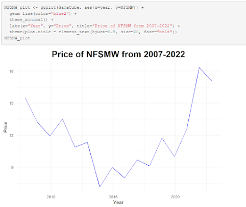
 Rather than use base R syntax for making a chart, I opted instead to use ggplot2, as it provides more options and is something I'm much more comfortable with and understand better. This graph showcases the price trend of a certain video game over time since its release in 2007. Over time, the price per copy has fallen, and then steadily rose during the pandemic years. While Stephen Few argues for the notion that correlation does not equal causation, I believe the pandemic could certainly be theorized as a contributing factor for the sharp increase in price per copy.

Module 6 Assignment: More with Matricies

Image
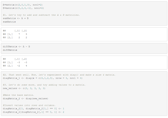
  Figuring out how to add values to an already-existing matrix took a fair amount of research + skimming through the textbook to figure out, but aside from that, this was a much more informative and fun matrix-involved assignment than the previous. GitHub link for code: https://github.com/Retrolovania/R_Programming/blob/main/Module%206.R

Module 5 Assignment: Figuring out Matricies

Image
 The original A and B matrices ended up not being in a proper format in order to find their inverse, so a fair bit of working around had to be done in order to find the solution. The process can be seen below: GitHub link for code: https://github.com/Retrolovania/R_Programming/blob/main/Module%205.R

Module 5: Discovering Plot.ly and understanding Plot of Whole

Image
 The main caveat with trying to visualize plot of whole is that it only really displays itself best when the data making up the whole can be fully separated into distinct parts. As we can see in this line + bar graph using the Average Position and Time dataset, however...  Both the position and time variables are connected together to the point that separating them into unique parts, like what a pie chart would do, isn't entirely viable. If, say, the data was instead about worker's weekly pay against the amount of money that can be shared between all of said workers, then Plot of Whole could be better realized in a visual depiction.

Module 4: Time Series Plot in Tableau

Image
 Using the data provided in the Monthly Modal Time Series dataset, I produced this multi-line graph showing multiple variable relating to vehicles in Springfield, IL, from how many licensed NTD IDs were created to the number of vehicular accidents over the span of five years. As the general population of this particular city has been decreasing in recent times, all of the numbers showcased in this graph are steadily decreasing with a sharp downward push in 2017-2018.