Part I: A. Null hypothesis: The cookie-making machine is making less than 70 cookies. Alternative hypothesis: The cookie-making machine is making either exactly 70, or more than 70 cookies. B. Z = (M – μ) / √(σ^2 / n) = (69.1 – 69) ) / √((3.5)^2 / 55) = (69.1 – 69) ) / √(12.25/ 55) = 0.1 / 0.47 Z = 0.21 (Greater than LOS of 0.05, so null hypothesis is not rejected.) C. A p-value of ~0.58 is mostly neutral, not leaning greatly towards 1 nor 0. Therefore, it is not statistically significant and the null hypothesis cannot be rejected. D. Z = (M – μ) / √(σ^2 / n) = (69.1 – 69) ) / √((1.75)^2 / 55) = (69.1 – 69) ) / √(3.06/55) = 0.1 / 0.0556 Z = 1.79 (Greater than LOS of 0.05, so null hypothesis is still not rejected.) E. Z = (M – μ) / √(σ^2 / n) = (69 – 69) ) / √((3.5)^2 / 55) = (69 – 69) ) / √(12.25/ 55) = 0 / 0.47 Z = 0 (Less than LOS...
Upon loading in the given code example for this assignment, the first thing I attempted to do was to simply run the code and see what would happen in order to better isolate a potential issue. That gave me the error shown here: Clearly something was amiss with the return argument, so that was the line I checked. It became obvious looking at it further that said argument shouldn't have been part of the same line as the line in brackets, so I isolated it into its own line. Making this fix allowed the code to be properly executed, and for the function to be created. Next was testing the function with an example matrix. Initially, it failed with this error: This exposed the other issue with the functions code; it seemed to depend on another function dubbed tukey.outlier that was completely missing, and therefore was interfering with the function's ability to be properly used. Commenting the line out and redefining the function allowed it to properly work once more. Resulting code ...
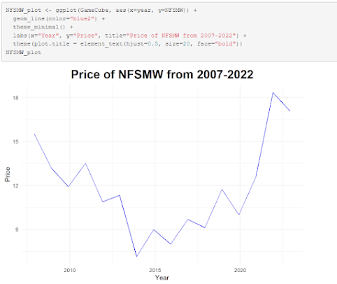
Rather than use base R syntax for making a chart, I opted instead to use ggplot2, as it provides more options and is something I'm much more comfortable with and understand better. This graph showcases the price trend of a certain video game over time since its release in 2007. Over time, the price per copy has fallen, and then steadily rose during the pandemic years. While Stephen Few argues for the notion that correlation does not equal causation, I believe the pandemic could certainly be theorized as a contributing factor for the sharp increase in price per copy.


Comments
Post a Comment