Posts

Showing posts from January, 2024

Module 4 Assignment: Boxplots and Histograms!

Image
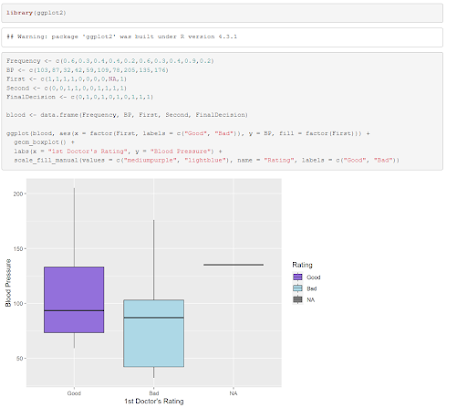
 In order to have a neater presentation of the boxplots for this assignment, I opted to use ggplot2 in lieu of the base R "boxplot" function. Reviewing the ratings given by both doctors, it seems that the 2nd was a lot more harsh, as the majority of his ratings were negative compared to the 1st. The majority of the blood pressure measurements taken are skewed to the left of the histogram, giving us an average blood pressure in said low area. (Mean = 102.6) GitHub code:  https://github.com/Retrolovania/R_Programming/blob/main/Module%204.R

Module 3: Adding Visuals to Tableau Graph

Image
 The main kicker of this graph besides the varying orange hues indicating the amount of deaths recorded per state is the design of the arrows signifying the two with the most and least amounts of death. The contrasting colors and direction of the dilation of the arrows invokes more of the purpose behind what each line is meant to represent, Kentucky's with the most and Alaska's with the least.

Module 3 Assignment: Data Frame Funsies.

Image
  Using the data provided to make this data frame, we can see that Donald Trump received the most poll numbers from both ABC and CBS, with Carly making the least number in the election. This data frame could be presented in a more visually appealing method, however, such as being used in a bar graph, as shown here: GitHub link: https://github.com/Retrolovania/R_Programming/blob/main/Module%203.R

Module 2: Making a Geological Map with Tableau

Image
 For this assignment, I went with a dataset containing the record of deaths suffered in the USA from a few different viral diseases from 2020 to 2023. For the purposes of this assignment, however, I chose to stick with deaths caused by pneumonia, a fairly common disease. Setting up the dataset in Tableau, I was greeted with this graph: The darker the shade of orange on each state, the more deaths that state had recorded in the three years that this data was collected in. Kentucky takes the lead at 751 deaths, with Alaska maintaining the lowest at 310 deaths. I feel some ways that the graph could be improved include having a small legend at the corner of the screen that lists a couple shades of orange, accompanied by number ranges showing how a certain shade corresponds to a certain estimated number of people who fatally contracted pneumonia. A better color gradient would also be highly beneficial, as the colors here aren't as clashing and intense as one would come to expect from a

Module 2 Assignment: Does this Function work?

 For this assignment, I was tasked with reviewing a snippet of R code to determine if it could run properly: assignment2 <- c(16, 18, 14, 22, 27, 17, 19, 17, 17, 22, 20, 22) myMean <- function(assignment2) { return(sum(assignment2)/length(assignment2)) } myMean(assignment2) While this code does work properly (returns the average of the assignment 2 vector), using the name of the vector within the function isn't necessary, as said name still needs to be used when he function is called. Using a more simple variable like "x" for defining the function is much more understandable to those who wish to reuse said function. myMean <- function(x) { return(sum(x)/length(x)) } (GitHub here: https://github.com/Retrolovania/R_Programming/blob/main/Module%202.R)

R Programming Post #1: GitHub location.

 The GitHub repo for hosting my assignments for this course can be found at https://github.com/Retrolovania/R_Programming. Hopefully won't be long before I can start adding to it!

Module 1: Intro to Visuals and how they Analyze

Image
 One recent analytical graph that caught my eye was this stylized bar graph from an article discussing the rising trend of streaming retro video games. (Article: https://www.socialmediatoday.com/news/youtube-shares-new-stats-growth-retro-gaming-themed-content/693472/)  The graph clearly depicts its information (that being the general amount of games from certain decades being streamed on YouTube) in a more understandable fashion while also being attractive to the eye, and utilizing a sort of retro-like imagery to stick to the main topic of both the article and the related info that the graph displays. It brings a fair bit more attention to the decades of games that're being streamed more on the platform, which to the average onlooker would come off as surprising compared to their plausible expectation of seeing more recent games taking the helm.